


The painter started work on the upstairs, and one room, I've designated as a space to house my Hermes boxes.
I did a colour match of the iconic orange box; but knew I would not be happy with such a yellow orange on my walls, so I chose one I could live with. Sherwin Williams, Knockout Orange.
Orange is a tricky colour to use, and I have used it in one hue or another, over the years.
In Florida, I used Sherwin Williams, Rejuvenate. It is aptly named, it's so refreshing, and makes me sigh with happiness, the second I walk in the door.
Oddly enough, it looks kind of muddy to me here in Ontario, so I didn't even consider using it for the dining room, which I'm doing in orange, and green.
The orange I used at the cottage, I can't even remember which brand, after sampling a number of oranges, and painting the entire room three times.
I still need to hang up the other two tacky peacock wall hangings. What can I say? It's a cottage, where else can you get away with it?
I still haven't committed to my dining room selection. It's either going to be Sherwin Williams, Energetic Orange, or Sherwin Williams, Daredevil.
I originally chose Sherwin Wiliams, Hearty Orange; but the sample looked drab with my upholstery fabric, and I need it to look lush, and fresh.
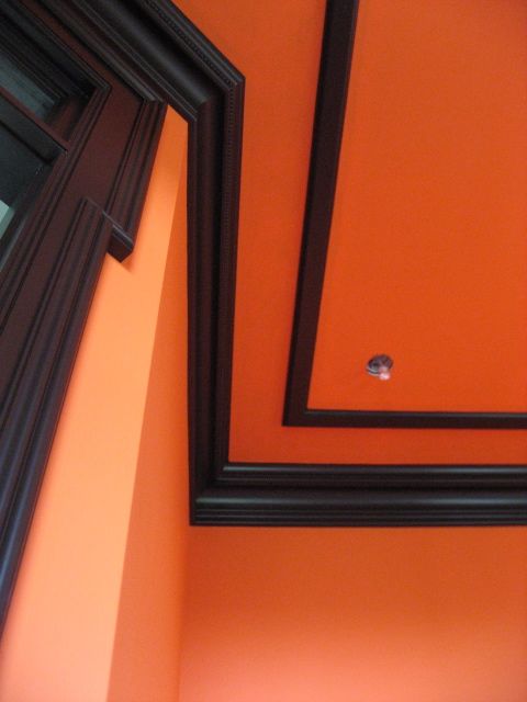
As for my Hermes inspired room, my selections for the wall, and trim colours, worked the first time. The trim colour was computer matched from a Hermes, saddle, book cover. It's the exact colour, of the brown trim, on the Hermes box.
The room has a south, west, exposure, so it was the room I felt would show these colours in the best light.
I can't resist including a few shots of the breathtaking sunset, we had last night at the cottage. The sky was so orange. I need a better camera, that can take pictures in low light, like the new Cannon PowerShot. Perfect timing,and it even comes in orange! That's the easiest orange decision I'll ever make.